Thinking what I’m thinking? That’s right… MERGERS happen.
Disappointed? As Duke Energy and Progress Energy finish sewing together their collective parts to become the largest U.S. utility, I can say, “so am I.”
Why? It has nothing to do with their conglomeration of power stations and transmission lines nor with the political and economic fallout that we may yet have to deal with (nothing to see here; move along). My disappointment is borne in what they will be sewing on their uniforms, affixing to signage and applying to their fleet. Yes, I am talking about the other “_________” happens.
REBRAND happens.
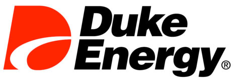
When Duke and Progress announced the ink had dried on their merger in July of last year, I knew it was coming. Duke has carried the large, red D with the white swoop through it since 1997 following the merger with PanEnergy. Who could blame them? I mean 16 years is a long time to have the same logo. Just ask Pepsi. But I wouldn’t have blamed them if they had stood pat.

Duke was the larger of the two; they brought the majority of customers to the table along with the money and the political influence. And what would it matter given that the two names the company will use due to federal regulations both carry the Duke name?
Instead, March 25 begins the official rollout of this:

Gyroscopes, orbits and swooshes, oh my! The Duke D, for all its generic 90’s clichés, at least gave you a sense of knowing what you were getting. The large D conveyed at least the scale and weight of a large utility. Add to it the psychology of the color red – strong, active, dare I say, power?
This new logo — designed in-house — attempts to hit on all the old clichés and tosses in a few that were less important 16 years ago to effectively become a fine example of design-by-committee. We only need to reference the press release from September that announced the new logo to see the meat that made the sausage.
“The logo represents a new beginning for a unified and stronger Duke Energy,” said Jim Rogers, chairman, president and CEO. I swear to God, is there a Rebrand Press Release template in MS Word® that I don’t know about? Of course the new logo represents a new beginning. What else would your new logo represent in a merger? And guess what? Unifying under the existing Duke Energy identity accomplishes just that.
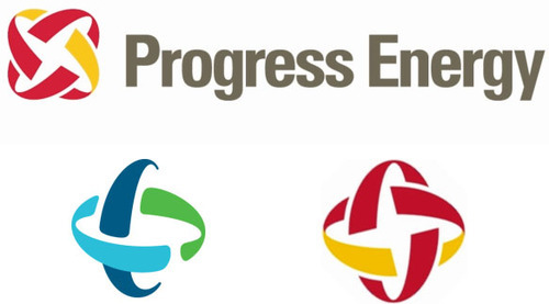
Mr. Rogers’ statement continues,“It also recognizes the rich histories of both Duke Energy and Progress Energy, reflecting the image of a world-class energy company.” Yes, Duke energy is 109 years old and Progress almost hit the century mark so a rich history of service and leadership is something to talk about. But there is no history in either company’s logos. IBM and Coca-Cola have rich histories in their logos. Bass Brewery has a rich history in its logo — look it up. Further, none of the equities from either Duke nor Progress Energy’s were spared. Not the colors. Not the typography. You could make a case for the swoops they shared but really, are swoops equity? You could also make the case that Progress is represented more in the similar shape of the mark itself.

So what about those colors? “The colors of the new logo reflect Duke Energy’s commitment to sustainability, technology and energy efficiency.” Granted, all three characteristics are admirable qualities you want in a utility — especially when you don’t have a choice in said utility. But the problem is trying to shove those ideas into color choices and is exacerbated when you choose to pander with green and blues. Which one did you say stands for technology, again? Just because you want to communicate that trinity, it doesn’t mean the logo — nor its colors — should do the heavy lifting.
Continuing, “The new logo depicts forward motion, representing energy for the future,” said Ginny Mackin, Duke Energy’s chief communications officer. “It draws on elements from the legacy companies’ logos: Progress Energy’s ‘star’ and the ‘swoosh’ in Duke Energy’s ‘D.’” Again with the legacy of two companies. It doesn’t matter. This is on paper, a merger but we know where the power (figurative) is held. The company would simply be Duke Energy if not for those meddling feds. What legacy is there to hold onto? You haven’t merged two family farms. No, these are billion dollar utility companies. And they are about as faceless as the high-tension lines that cut through those old family farms. The only way we know who owns those lines is because there is only one company that could own them.
To the first part of Ms. Mackin’s statement, I see no forward motion. I see circular motion — both horizontal and vertical — but nothing forward. And what of that “energy for the future”? Are we to believe it represents a commitment to wind, solar, geothermal, nuclear? Or is it a metaphorical energy for the future that exists within the company?
It’s difficult to say because it’s not really saying anything.
Beyond the corporate speak, the new logo is uninspired and watered down. I wonder if there was a little “heh-heh” uttered when the logo was set in Futura. A typeface that is ill-proportioned for this lockup and is set pretty much straight out of the box with little attention to detail other than taking the time to clip the sharp overshoots on the “N.” It also feels rushed. The “Y” is really hanging out there by itself, perhaps trying to coax the registered trademark to also come back to the group. Further, I’m confused by their expressed desire to present a softer, gentler giant but yet they settled on an all-caps setting of the name.
Like any company going through a merger, Duke Energy had an opportunity to do something significant. Unfortunately, it is a missed opportunity and possibly an unnecessary one. Again, I wouldn’t have blamed them if they had decided to keep the the current Duke Energy identity.
My hope is that companies great and small will fight the desire to say something meaningless about their merged brands at the risk of avoiding creating something equally as vapid in the process. I can more easily swallow an explanation of “our focus is on serving our customers by transitioning only a portion of our acquired fleet, locations and other assets; a decidedly better use of our resources and capital while growing our brand in newly acquired markets.” Rather, we continue to hear, “our new logo represents everything past, present and future about our two companies all at once.”
Like I said, “_________” happens.
——-
About our guest blogger
Contrary to popular belief, Brady Bone does actually like a lot of things (though spec-work, abysmal writing skills and a blatant lack of critical thinking are at the bottom of that list). He is a founding board member and former President of AIGA Charlotte. Most recently he was Director of Design at LKM. Currently he is a freelance art director and strategic design collaborator.